Timeless. Ageless. Everlasting.
The “lovely” collection of Schön is a conceptual perfume line that was inspired by German translation. Schön was developed to be a classic product line sold as a set of elegant crystal bottles. Geometric patterns and a crisp color palette express the cultivated beauty and great taste symbolic of the women wearing it. Named after jewel-like structures, and reflective of terms of endearment, Lovely Gem, Jewel, and Treasure resonate the superiority, sophistication and wealth suggestive of jewels.
In these publications, family history, interactions, and experiences are captured through photography, illustrations and short stories. The size and chaos of my family, along with the quirky personalities and funny stories gathered is why this publication is centered around a circus theme. There are two volumes, the first one is subtitled “Process” and is centered around the family meat processing business. The second volume is called “Preserve” and expresses the process of canning, gardening, and sharing meals together as a family. My intention is that these collections of shared stories will become a comfort for my family to look back on. For the outside audience, these stories provide a unique and entertaining perspective on family, how it adds character to oneself and creates a stable foundation to grow upon.
National Gold ADDY Publication Winner
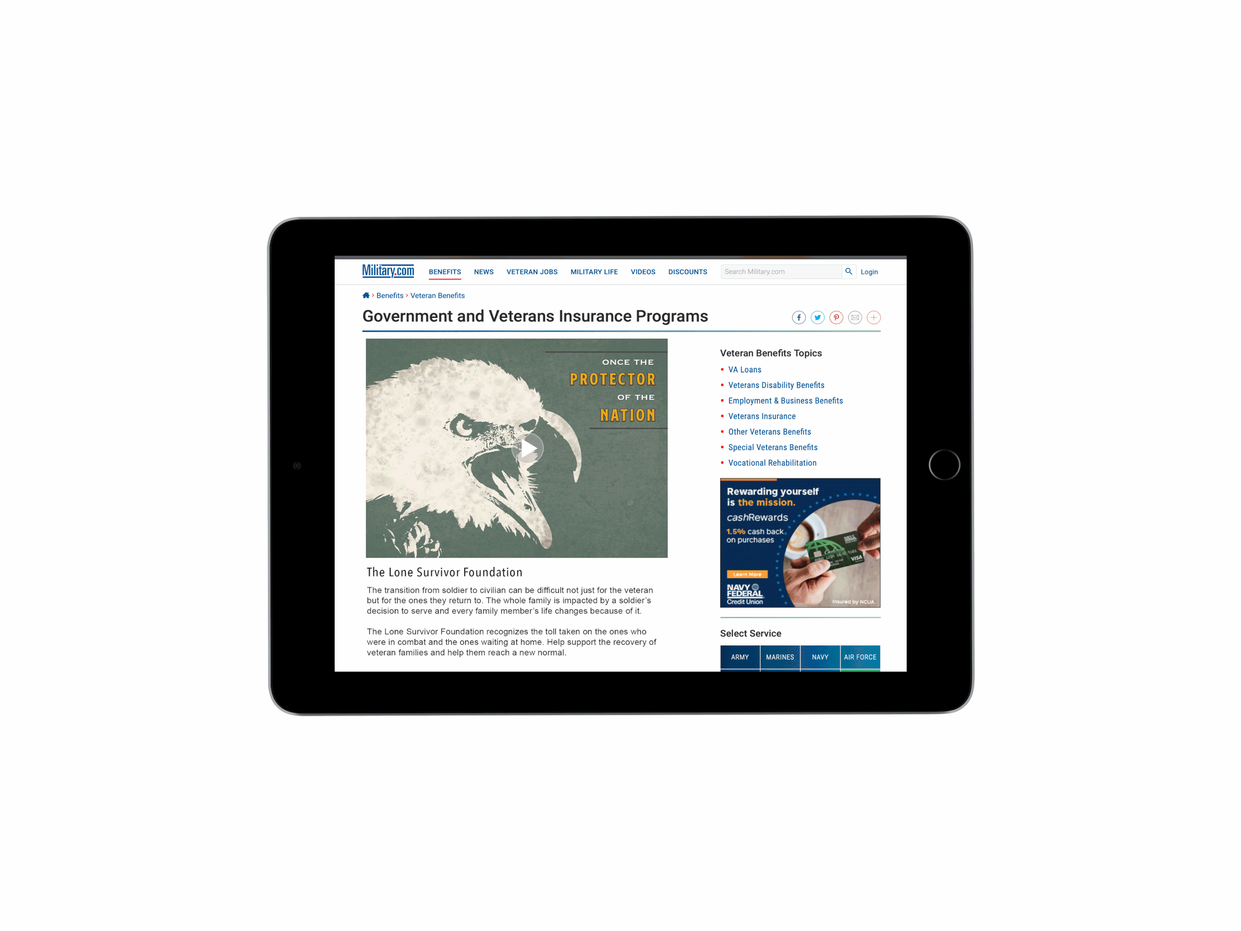
PTSD is an issue experienced by people who have gone through traumatic experiences, especially veterans. The LSF is a good organization to support because the funds help impact and benefit not only the soldiers but their entire family units. Their programs help save marriages and reconnect veterans with their kids. The need and benefits of this organization are expressed by showing the contrasting roles veterans have from when they are serving verses when they are back as civilians. This shows how much of an adjustment it is to switch between those roles. Those who overcome the adjustment can provide inspiration for those who are struggling. In addition, others who understand or connect with the messages that are shown are encouraged to help.
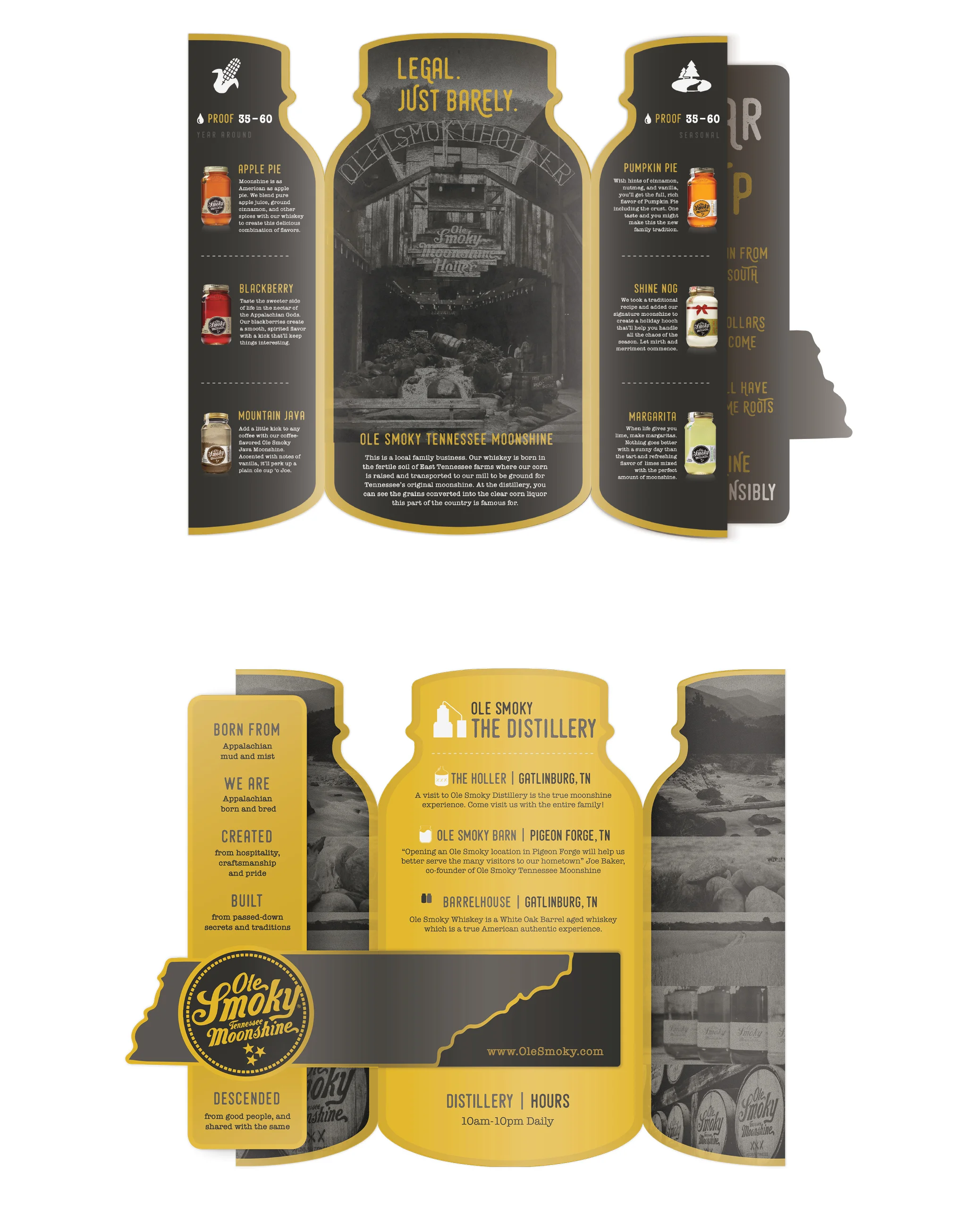
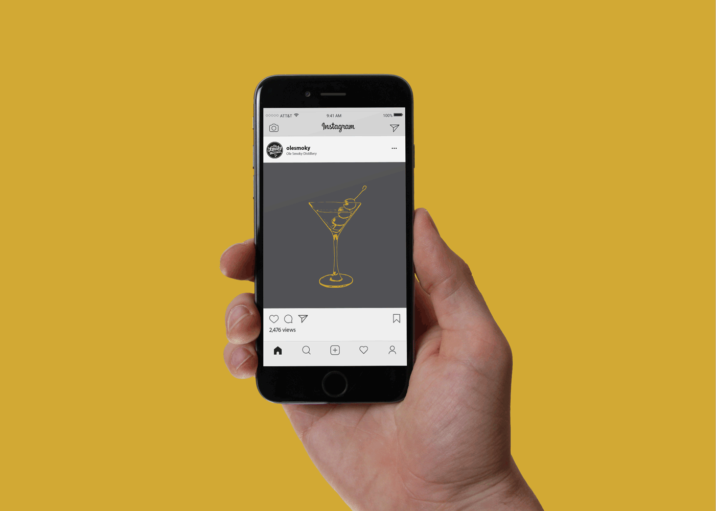
Ole Smoky Moonshine is the first legal moonshine distillery in Tennessee. Their branding reaches out to a variety of people, embracing old traditions and applying them in a fun modern way. This campaign’s goal is to increase the consumer demographic for Ole Smoky by enticing urban millennials to try this product as well as serving a way to bridge the gap between urban and rural audiences through implied messaging and imagery. The product is supposed to be relatable but unique, while still recognizing the wild roots behind making and consuming moonshine. The campaign runs on the idea of moonshine being alcohol’s cousin from the south; wild and crazy, yet still enjoyable.
The current ALDI brand identity lacks the company’s overall helpful nature and can be interpreted as corporate, and their communication and visual techniques are usually an overload of information. In order to integrate and align the overall brand experience, a redesign for ALDI’s messaging and visualization is shown through a mixed-media brand campaign. The new logo design pushes the brand’s values of simplicity, consistency, and family by swapping the old “A” for a lowercase German styled “a” but keeping the consistency of the rounded rectangle that is more empathetic towards customers and the company’s heritage. “ALDI Gets It” is the title for ALDI’s new campaign and is all about how they understand the value of your dollar. Many of the headlines and copy for the campaign utilize popular and well-known idioms to further express the approachability and understanding nature of the brand.
Negative self-body image can hold women back from experiencing life. Women often think the “if-only” body will make them happy or fix their problems, but often it’s not the external issue, but rather the internal one that needs to be resolved. Taking from the popular phrase, “fake it to make it,” the overall idea behind this campaign is to ignore the feelings that hold women back and encouraging them to fake that they have confidence until they actually do. The goal of Fake It Make It is to provide women with tips and tasks that establish habits to think positively and ignore the negatives about themselves. This campaign is meant to come across as confident and direct yet earnest and attainable.
The Ball Mason Jar campaign showcases the variety of jars the Ball Company supplies for its customers and how the jar has grown past its original purpose for canning. With such a multitude of sizes at people’s disposal, the possible uses are endless. The mason jar is an approachable product and that essence is captured through an illustrative aesthetic. The imagery showcases the versatility of the product and sizes by connecting different ways customers take advantage of the jars throughout various stages of life.
Silver ADDY Winner